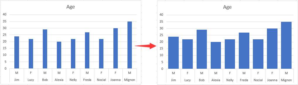
Налаштуйте стовпчасту діаграму, щоб зробити ширину ширшою в Excel
Щоб зробити штрих ширшим на гістограмі, виконайте наступні дії.
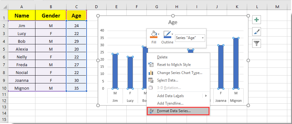
1. Клацніть на будь-яку панель на гістограмі та клацніть правою кнопкою миші, а потім виберіть Форматувати ряд даних з меню правої клавіші миші. Дивіться знімок екрана:
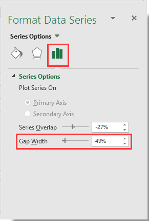
2. У спливаючому Форматувати ряд даних панель, перемістіть Zoom бар Ширина зазору ліворуч, поки ширина бруска не відповідатиме вашим потребам під Параметри серії розділ. Дивіться знімок екрана.
3. Закрийте Форматувати ряд даних панель
Тоді ви бачите, як смуги на зазначеній гістограмі стають ширшими, як показано на знімку екрана.
Покращуйте свої навички Excel за допомогою Kutools для Excel і відчуйте ефективність, як ніколи раніше. Kutools для Excel пропонує понад 300 додаткових функцій для підвищення продуктивності та економії часу. Натисніть тут, щоб отримати функцію, яка вам найбільше потрібна...
This comment was minimized by the moderator on the site
Also been looking for a way to do this. Line chart over dates/times with bars when data (KGs) increased i.e. new delivery. Rather than change x axis type to text, I ended up having a filled border on bar. Need to select the same color fill as line and then select the border width to widen the bar. Can be done in VBA if chart is being produced with VBA?
This comment was minimized by the moderator on the site
Sorry... this doesn't work on a PC with Office365 2020.10. The control is there but even when set to zero percent for the gap width, the bars are scrawny little narrow bars which will accommodate no text overlay. Something not right.
This comment was minimized by the moderator on the site
Not in office365 but it might work for you, I have found a similar issue with "scrawny" bars on dates that adjusting overlay and gap width don't correct. To fix was as simple as reordering my data from oldest to newest and then changing axis type to "text axis" rather than "date axis" and then adjusting overlay and gap width. Give it a crack?
")
")